
Pineapple Financial
Building a Scalable Brand System
Following the brands’ transition from Canadian Lending Centre to Pineapple Financial in 2021, the company had established a fresh identity that reflected its modern vision for the mortgage industry. While the new name and logo resonated with leadership, the visual identity lacked the depth and flexibility needed to support a rapidly growing brokerage preparing for national expansion and its upcoming IPO.
As Creative Director, I was brought on to grow the internal team and evolve the brand into a cohesive, scalable system that agents would proudly represent and customers would trust. Rather than redesigning the identity, I refined and matured it, developing comprehensive brand standards, modernizing the visual language, and creating the governance needed to ensure consistency across every touchpoint.
My Role
As Creative Director, I led Pineapple's brand evolution from strategy through implementation. Working closely with the CEO, COO, and executive leadership, I developed a comprehensive visual system that strengthened the company's identity while preserving the core elements introduced during the original rebrand.
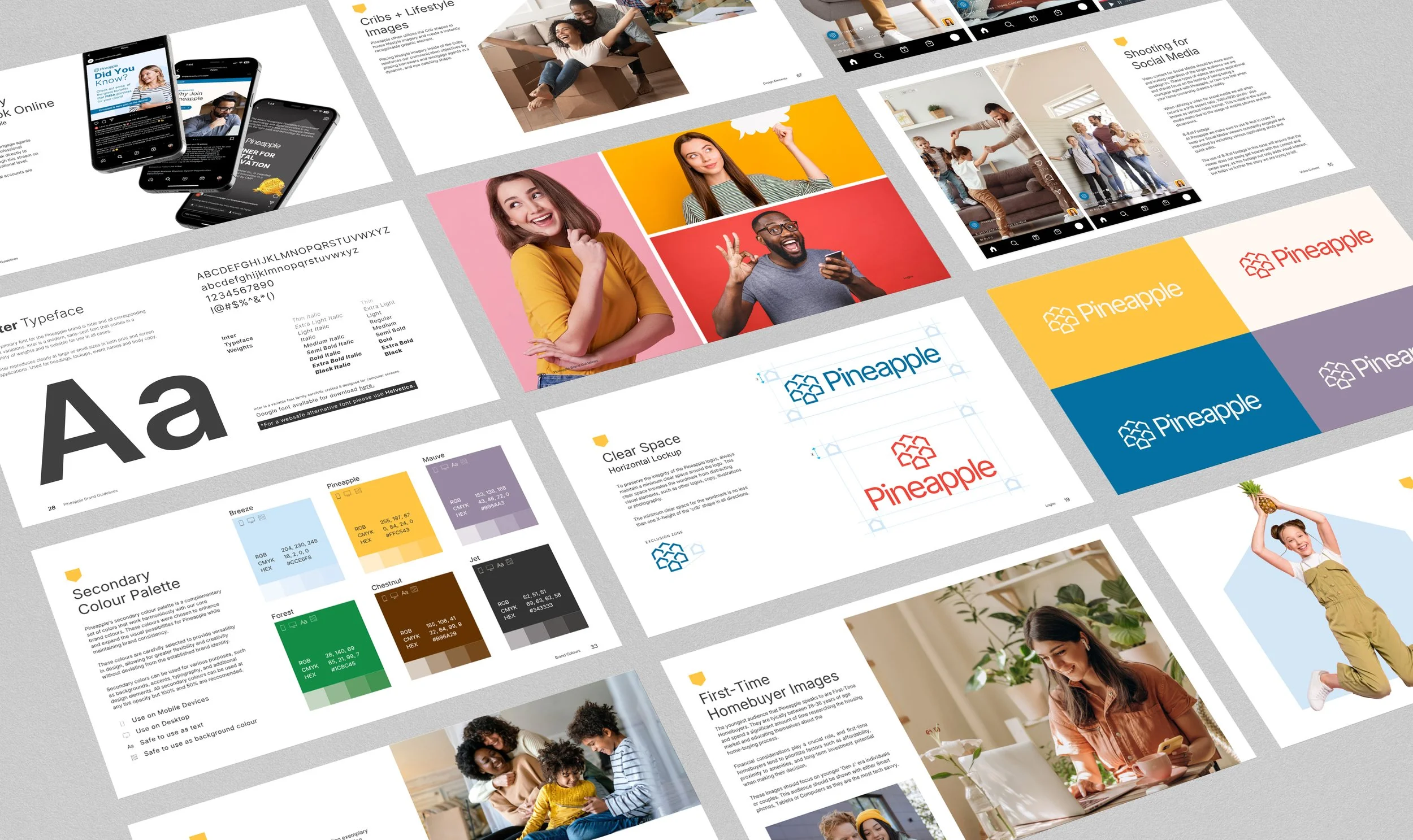
My responsibilities included building a more all-encompassing guide focusing on evolving the colour palette, updating typography treatments, detailing photography direction, tone of voice, and brand architecture to better fit with the new tech-forward business strategy. I authored an all-new 71-page Brand Guidelines document, created scalable sub-brand systems, established photography and videography standards, built Canva templates and shared asset libraries, and developed training materials for both corporate teams and more than 600+ mortgage agents. I also led internal rollout sessions and partnered with developers to redesign the corporate website using the new brand standards.

The Challenge
Building Confidence in a Growing Brand
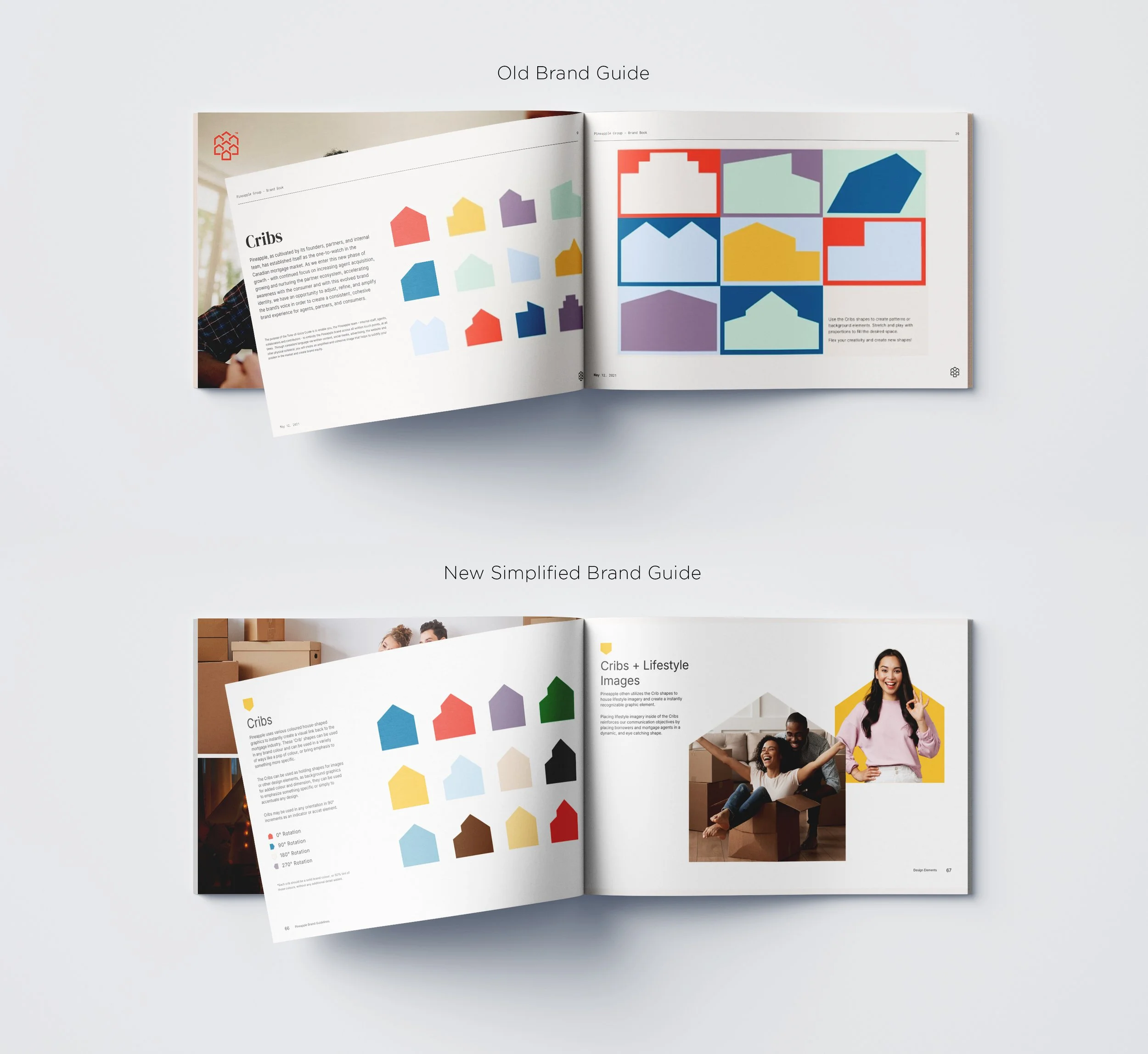
While Pineapple's original identity successfully introduced the company to the market, it struggled to resonate with a growing network of mortgage professionals. Leadership and agent feedback consistently pointed to a brand that felt too soft, illustration-heavy, and visually disconnected from the confidence and professionalism expected within Canada's mortgage industry.
With an IPO planned for the future and aggressive recruitment goals ahead, Pineapple needed a more mature brand system that could appeal to both consumers and mortgage agents, improve consistency across departments, and support long-term growth without abandoning the personality that made the company unique.
The Insight
Great Brands Don't Need Reinvention. They Need Evolution.
The Pineapple logo already carried strong recognition and positive sentiment. The opportunity wasn't to replace the brand, but to strengthen the visual language surrounding it.
By shifting from muted colours and playful illustrations to bold colour palettes, authentic lifestyle photography, expressive portraiture, and modern typography, we could create a more confident and human-centred identity that better reflected Pineapple's culture while improving accessibility, consistency, and usability across every platform.

The Evolution
Building a Brand Designed for Scale
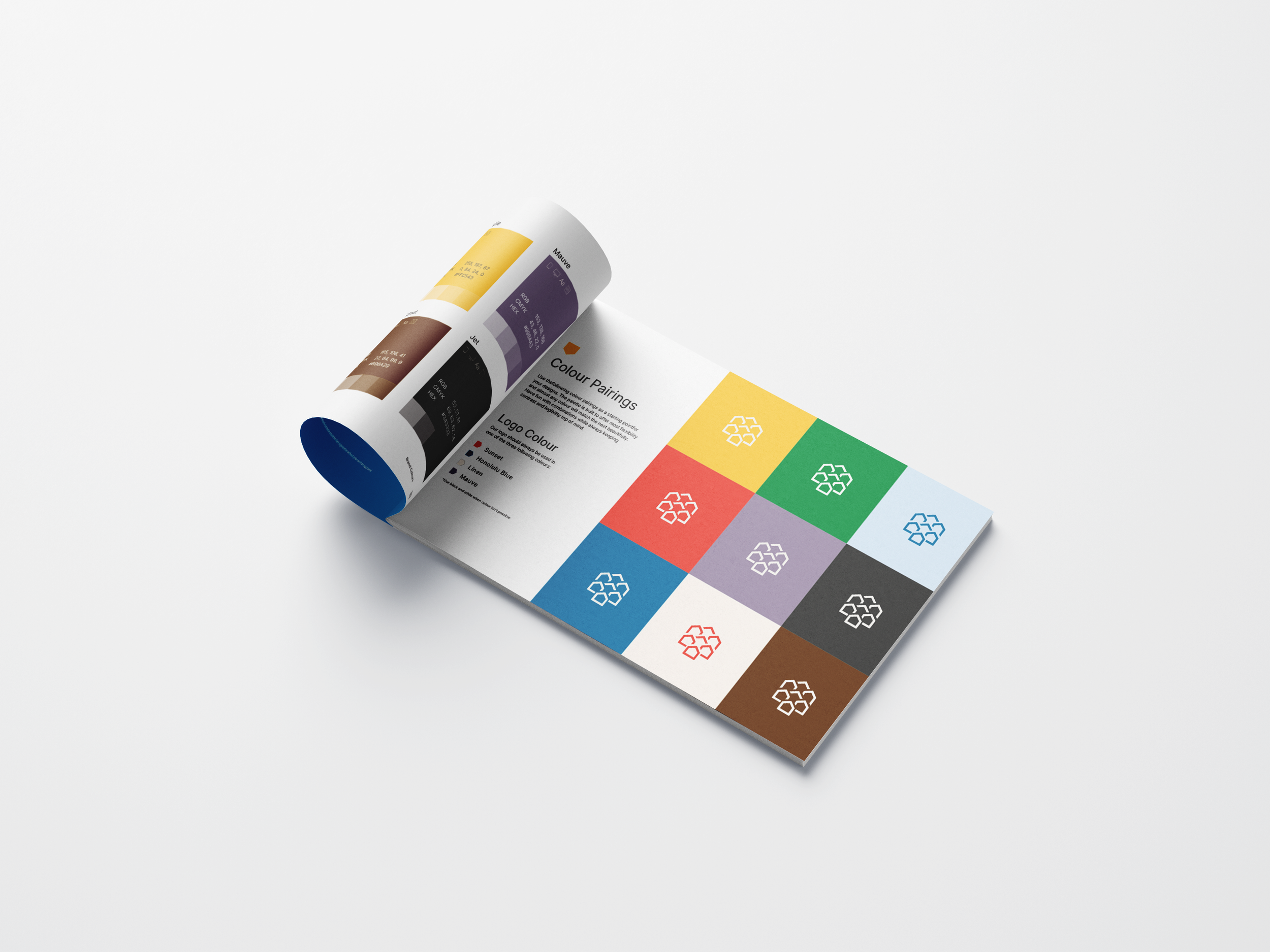
The evolution focused on creating a flexible design system rather than a collection of individual assets. I simplified the brand elements by introducing a stronger colour hierarchy centred around Pineapple's signature Sunset and Honolulu Blue, improving visual impact while increasing accessibility and contrast across digital and print applications.
Illustrations were retired in favour of authentic photography that showcased real people and genuine moments. I developed detailed photography guidelines covering lifestyle imagery, expressive portraiture, and audience-specific examples for both consumers and mortgage professionals, allowing future creative teams to maintain consistency regardless of campaign or channel.
To support the company's rapid growth, I shifted focus to a more people-focused approach and expanded the brand architecture with standardized colour pairings, sub-brand frameworks, typography rules, social media guidance, videography standards, and reusable design components that could scale across future initiatives without reinventing the brand each time.

The Execution
Turning Brand Standards Into Everyday Practice
The final deliverable was a comprehensive 10-section Brand Guidelines document that extended far beyond traditional logo usage. It established clear standards for visual identity, messaging, photography, videography, social media, and design systems while introducing practical resources that empowered teams to create on-brand content independently.
To support adoption, I developed Canva templates, presentation templates, centralized asset libraries, and training programs for corporate staff and mortgage agents. The brand evolution was rolled out company-wide ahead of the IPO, becoming the foundation for future marketing initiatives, recruitment campaigns, website redesigns, event branding, and day-to-day communications.

The Launch & Impact
Creating a Brand Built for Growth
Rather than simply refreshing Pineapple's appearance, the project established the governance and systems needed to support a rapidly scaling organization.
Developed a comprehensive 71-page brand system adopted across the organization.
Successfully evolved the brand ahead of Pineapple Financial's IPO and national growth.
Improved brand adoption among corporate teams and mortgage agents through training, templates, and centralized assets.
Streamlined creative production with standardized design systems, reducing development time across marketing initiatives.
Created scalable brand frameworks supporting events, recruitment campaigns, digital marketing, and future sub-brands.
Established long-term creative governance that continues to guide Pineapple's visual identity across all touchpoints.
To comply with non-disclosure agreements, I have omitted and obfuscated confidential information in this case study.
All information in this case study is my own and does not necessarily reflect the views of Pineapple Financial.